‘Celebrating Colours of India’
by Opus Paints
Campaign Context…
Evolving from its ‘Duniya Ko Rang Do’ philosophy, Birla Opus Paints launched their next campaign ‘Celebrating Colours of India’ in 2025 to continue the buzz they successfully created with their previous campaign of 2024.
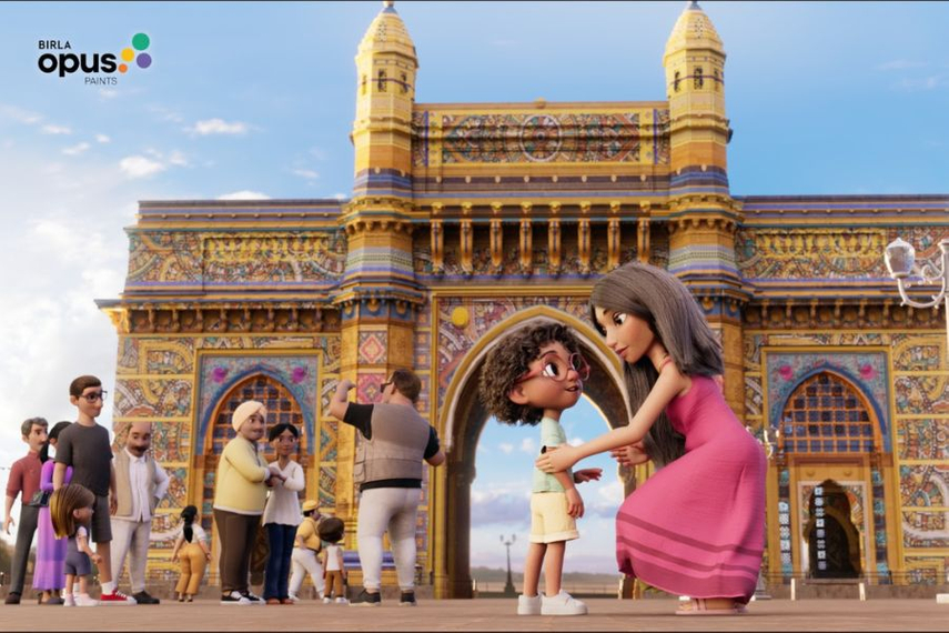
Beginning with the Gateway of India and extending to Jaipur’s Hawa Mahal, the campaign uses vibrant colours to reimagine iconic national monuments.
The animated films feature the Opus Boy, spreading joy and highlighting colour’s transformative power to transform not just spaces, but also rekindle pride, beauty, and transformation across the nation.
The campaign showcases how beauty can open avenues of wonder and storytelling. On the launch event, the CEO said, “The campaign video celebrates India’s heritage by reimagining possibilities of transformation through vibrant colours and patterns. The film reinforces the influence of colours and our commitment to beautify spaces, while contributing to the national spirit and pride.”
The Head of Marketing for the company said, “Our philosophy has always been centered on the profound impact of colour, and with our new campaign, we are taking this belief to a national canvas.
By showcasing the potential of our paints with places of national heritage and deep cultural significance, we aim to create a powerful story of hope, reminding every Indian of the beauty around them and the transformative potential of paints.”
The CCO of the creative agency Leo India that designed the campaign said, “Building on the success of the much-loved launch film, this new set of amplifies the central theme of the brand – ‘Duniya Ko Rang Do ’.
We’ve continued our use of 3D feature animation to create a rich, immersive experience this time set against the backdrop of one of India’s most iconic visuals. Their grandeur and timelessness serve as the perfect canvas to inspire audiences to reimagine the world through the transformative power of colour.”
Our analysis of the campaign…
The film opens with a familiar scene at the Gateway of India, where a photographer struggles to pique people’s interest in capturing themselves with the monument’s allure.
The young Opus boy, observing this, is inspired to bring about a change. With the Opus touch, the monument bursts into vibrant colour and patterns, captivating onlookers and reigniting a desire to engage further with its beauty.
This transformation not only uplifts the monument but also brings joy and renewed purpose to the photographer, a reminder that beauty can revive more than just walls, it can truly transform one’s world, it added.
The brand has released a subsequent video in the series as part of the campaign. Set against the backdrop of Jaipur’s Hawa Mahal, this animated film brings alive the essence, pride and visual richness of India’s heritage through the lens of colour, echoing the brand’s enduring belief.
The 2nd installment continues the animated approach, reintroducing the beloved Opus Boy as he endeavors to spread joy and deepen the premise of transformation through colour.
Demonstrating how beauty can open avenues of wonder and storytelling, the film beautifully captures his role in bringing joy to clean-up marshals stationed at the monument, as the transformative power of color inspires a renewed community commitment to keep surroundings around them clean.
In both the video ads, the brand has never ever talked about its differentiator/USP, they have just stick to the power of colours in changing not just the object but also the surrounding environment and have tried to associate their brand to this powerful feeling.
Everybody would agree that colours definitely impacts the mood of the viewer and hence can be a powerful drive of change. The brand ad shows this by demonstrating how the colourfully painted place prevents the people from littering all around making the tourist spot clean and loving again.
The brand repeatedly emphasizes its philosophy (purpose + value system) in a way to connect with the viewers and subtly tries to capture the feeling of clean, beautifully coloured spaces which anybody can relate to, which makes this brand marketing case study a classic lesson for every founder.